
Sony Design:
MAKING MODERN
Kyoto Exhibition Talk
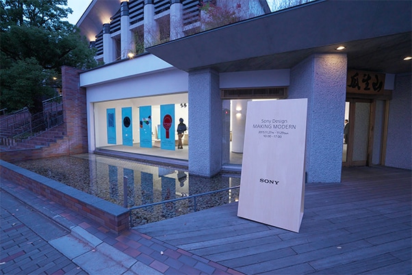
The Sony Design: MAKING MODERN exhibition was held in the midst of the Kyoto autumn season. This exhibition, which lasted just three days,
featured recent work that represents the Sony Design philosophy—including prototypes and the latest products from 2015—and designs for successive generations of models that were popular at the Ginza exhibition. On November 28, the second day, a talk was held with six of Sony’s designers.
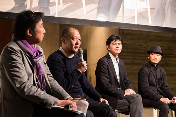
What is Sony Design, which embodies Sony’s spirit of taking on challenges for “doing what has never been done before?” The six designers discussed
their personal feelings and considered the design of tomorrow together with the participants.

Hasegawa became the director in 2014 after gaining a broad range of experience in an array of design fields.

Sawai‘s designs include the entertainment robot, QRIO.
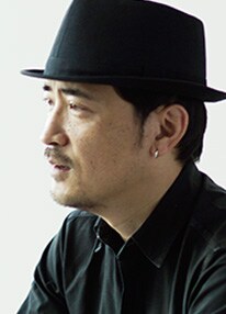
Takuma is in charge of overall art direction for products in the audio category.

Tako is in charge of art direction for home category products and overall R&D projects.

Fukuhara is in charge of art direction for the overall communication field, including proposals for developing Sony’s corporate typeface.
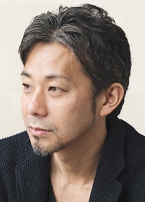
Ishii is currently in charge of art direction for areas including smartphones, and has also created designs in new business fields.
Presentations
by six designers
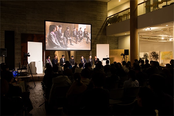
The number of people who registered in advance was much larger than initially anticipated, so the venue for this talk was changed to a large gallery on the same campus. There were also many people who arrived without registering, resulting in a very lively atmosphere in anticipation of the event.
Six designers took the stage, including the Director of the Creative Center. Although each of their presentations was limited to just 20 minutes, each nevertheless conveyed a great deal of information about the present state and future of Sony Design, using their own projects and products as examples.
Sony Design has been cultivated
via thorough discussions
at “Design Shingi”
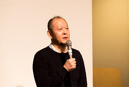
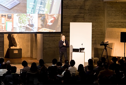
Creative Center Director Yutaka Hasegawa, who is the leader of Sony Design, was the first speaker. He discussed his thoughts about the Sony Design philosophy while giving guidance for the entire talk.
Sony will celebrate its 70th anniversary in 2016, and throughout its history has constantly been renowned for its innovative spirit of creating things the world has never seen before. Hasegawa said that a fusion—and harmony—of technology and design is essential to that end. He mentioned the playfulness, sense of adventure, and engagement with all the five senses that underlie these designs, and talked about how a common understanding is maintained regarding Sony Design.
Hasegawa: We always hold conferences called “Design Shingi,” which I think is a unique approach. The designers engage in thorough discussions on all sorts of topics that are not limited to specific product categories or areas of specialty. This approach is so widespread that Sony’s overseas designers even use the word “Shingi” in English. We deepen our awareness through these Design Shingi, placing great importance on what is cultivated as tacit knowledge.
Hasegawa explained the significance of design approaches that create a total worldview—from single products to shops and events—while introducing new examples not limited to electronics, including Sony Bank and the Sony Real Estate business for which sales activities started last year. He then concluded his talk as follows:
Hasegawa: No matter what new domains we operate our business in, I want to be dedicated to the concept of creating new standards. I also hope for everyone to watch these various challenges so that we can receive direct opinions on both positive and negative aspects.
The robot design of the future
will fuse motion and interaction
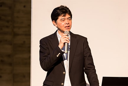

Kunihito Sawai designed QRIO, the bipedal entertainment robot. He gave a careful explanation about the robot design process, and then discussed “motion” and “interaction” as necessary factors for future robot design. QRIO is a robot focused on motion, but interaction will be required from now on. It may be difficult to immediately develop robots that perfectly and naturally interact with humans, but he said, “We can use design to give this impression.” He also showed a demo video of the BSP60 Smart Bluetooth® Speaker.
Sawai: Rather than increasing convenience by having users manipulate tools, users can achieve the same things simply by depending on the robot. This concept is called “Concierge Interface,” and we wondered if we could leverage it in design. In the BSP60 demonstration video, there is a scene in which the user asks the speaker to make a phone call, which it does immediately. I think the potential of robot design lies in things of this sort.
Design philosophy
that
beautifully portrays
negative space
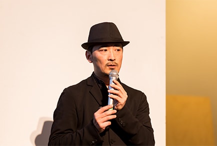

Tomoaki Takuma is involved in art direction for the overall audio segment. He spoke about h.ear™, headphones that were just released in November 2015 with High-Resolution Audio quality, as well as the diversity and identity creation behind this product. h.ear headphones were developed for discerning people who want to enjoy high-quality sound but are not dedicated audiophiles. They do not give a mechanical impression, but instead feature an exceedingly simple, stylish design. The key to this worldview is CMF: color, material, and finish. All parts used in the headphones, packaging, and even shop fronts feature a “single color finish” and “color in between.” Namely, a finish is used so that parts with different textures appear to be the same color, with colors that give different impressions to different people. To accomplish this, special attention was paid to the hues used, which involved over 1,000 different attempts before reaching a satisfactory conclusion. Afterwards, he explained the concept of “Negative Space,” a design term that is shared in all Sony’s audio products with diverse, original qualities.
Takuma: We have reduced the unnecessary objects to create a simple form in which the remaining elements are pared down. When the elements that compose this product form a single mass with the same feel, beautiful negative space is effectively created between each object, rather than the individual objects. That is the theme we worked with.
In this way, this common design terminology is beneficial not only in branding, but also smoother communication with the development team and users.
How should electronics exist
in living spaces?

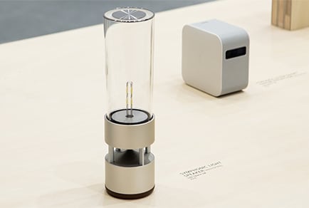
Hirotaka Tako is involved in the Life Space UX series of products that were born from the concept of how electronics should exist in living spaces; the designers re-defined this fundamental concept to create products that are closely tied to daily life. Tako said that, during the development process, they considered and expanded the context (such as background and circumstances) for each product to create the designs.
Tako: For instance, the Life Space UX series includes the LSPX-W1S 4K Ultra Short Throw Projector, which is positioned as a product that exists in the space between architecture and furniture. This context is expressed with the phrases, “placed in front of a wall,” “below a large 147-inch image,” and “4K high-definition images that look like photographs.” It evokes the image of a stage and has a form that purposefully resembles a stretch of horizon. This led to the top panel of the projector that opens in a way that resembles a rising curtain.
In addition, he also explained the individual contexts for the LSPX-100E26J LED bulb Speaker, Portable Ultra Short Throw Projector, and Glass Sound Speaker. In this way, he discussed the contextual design for the Life Space UX series of products that are closely embedded in living spaces.
Finally, Tako ended his talk by actually using the Portable Ultra Short Throw Projector and Glass Sound Speaker to conclude his demonstration, saying, “We place great importance on the idea of new platforms that allow creators and users to freely come up with ways of using these products.”

The creation of SST®,
the original Sony font,
was an inevitable development
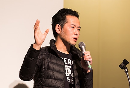
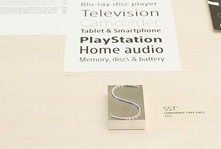
Hiroshige Fukuhara introduced SST, the original font that became the Sony corporate typeface this year. Sony carries out business across the world in a wide range of domains such as entertainment and financial services. SST was designed to convey the same message via the same typeface, and the aim from the initial stage was to be able to use this font in 93 different languages to cover the majority of the countries in which Sony does business. The typeface was jointly developed with Monotype Imaging Inc., which has a long history in typeface design and holds the licenses to Helvetica® and Frutiger®. SST was intended to combine the rigidity of Helvetica with the easy-to-read look of Frutiger.
Fukuhara: In communication design, it is important that the user gets an immediate sense of the message after a quick look at the design, as well as a rather positive impression. I think it is nearly impossible to achieve 100% of one’s aims from the initial stage—if that were possible, everyone would be doing it. I would rather strive for 100% by gradually building up 1% at a time.
At the beginning of his talk, Fukuhara said, “Why did we create SST? Because we knew the importance of having such a font. When thinking about and imagining if Sony had an original font, one realizes that it should exist. It’s important to believe in this.” He ended his talk by emphasizing the importance of “intention.”
Vigorous new product development in a new business creation program
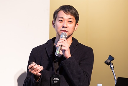
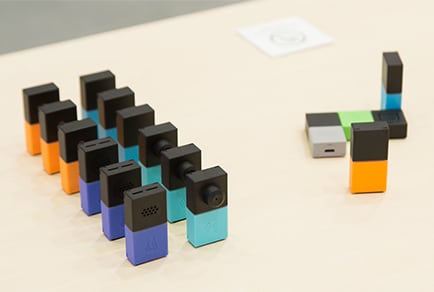
The last speaker was Daisuke Ishii, who introduced the Seed Acceleration Program (SAP), Sony’s new business creation program that was started in 2014. The Creative Lounge on the first floor of Sony’s Headquarters building is used as a co-creation space. Business auditions are held within the company, and the teams whose proposals are chosen serve central roles as leaders in varied, repeated trials with the aim of commercialization. In this way, products are developed in a totally different process from the past. Design abilities are an essential part of this process. Small teams that include designers make multiple attempts at embodying ideas such as UI and branding.
As an example of this, Ishii introduced the wena wrist, a wearable device that was so popular it gathered more than 10 times the target amount in crowdfunding, as well as MESH™, a smart DIY kit linked with an app that Ishii designed himself. When designing MESH, Ishii did not immediately start working. Instead, he narrowed down the ideas through repeated discussions and workshops inside and outside the company.
Ishii: First, we conducted repeated user trials on product ideas to explore their essence. From that point, we carried out the design process in a way that unified industrial, communication, and user interface design. User trials were held again before we proceeded to commercialization. I think it was important for us to notice new things each time we conducted the trials that led us to the next step.
A discussion that deepened
the consideration of
Sony’s unique qualities
Finally, the six designers appeared on stage together to answer audience questions, many of which concerned Sony’s unique qualities. This was an opportunity for the designers and audience members to more deeply consider the Sony Design philosophy and design of tomorrow.
Ishii: I think the most Sony-like answer involves getting rid of all unneeded elements, thinking about the goals and essence, and then focusing on these things. An example is the Walkman, which was essentially the size of a cassette tape. I feel that the Sony brand leads to minimum definitions of this sort.
Takuma: I think one of Sony’s unique methods is our Design Shingi that are held for each new product, in which the designers hold nothing back as they discuss the product over and over again. I feel that these thorough discussions create a common understanding or “tacit knowledge.”
Tako began by saying, “This just occurred to me...”
Tako: We always attempt to define Sony’s unique qualities and create guidelines. But I think the most favorable time is when people are asking about our unique qualities—I believe it’s best for people outside of the company to have a sense of these unique qualities.
After the question-and-answer session, Producer Kazuo Ichikawa of the Creative Center, who was the master of ceremonies and overall producer for the event, concluded the talk as follows:
Ichikawa: There are actually few examples in the world of companies like Sony whose business spans entertainment to the finance sector. We create designs while keeping this whole view in perspective. Perhaps the answer is that we are still exploring the unique qualities of Sony, which will continue evolving.
SST is a trademark of Monotype GmbH registered in the U.S. Patent and Trademark Office and may be registered in certain other jurisdictions.
Helvetica and Frutiger are trademarks of Monotype Imaging Inc. registered in the U.S. Patent and Trademark Office and may be registered in certain other jurisdictions.
